Showing posts with label graphic. Show all posts

Saturday, 10 May 2008

Heavenly Spheres 2


Hey.

I've mentioned my love for space-based illustrations on an earlier post. So, surprise-surprise, here is another piece. Most of the Photoshop techniques I used are similar to the last piece, but I used some new ones regarding the planets' texture, which involved extensive use of the liquify, smudge, burn, and dodge tools, as well as liberal doses of hue layers to create the colors.

I'll start doing some more traditional modern graphic design pieces, starting tomorrow. While I enjoy my more personal work, popular graphic design is moving towards a specific direction and I definitely don't want my work to feel outdated or lacking freshness. So, check this space out.

Wednesday, 30 April 2008

Eye candy

Hey world.

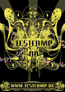
New assignment. Make a poster for testcamp, a scheme for young graphic designers. Simple enough.

With this image, I'm feeling like I'm finding my own personal style. It's a style I like to call Visual Free-Form, or, in layman's terms, make the viewer find something new in the image the 20th time they look at it. It's something one of my favorite artists, Hieronymus Bosch, did back in the Middle ages. The concept is simple; visually represent the activities that testcamp and its parent company Nørgård Mikkelsen are known for, i.e. radiospots, tv ads, posters, logos, graphic design and alternative advertising.

Now, I'm not going to start adding speakers, tv sets and the like. That's just too simplistic and obvious. Consumers can always understand when they are being patronized and they act accordingly. It's one of my pet peeves that advertisers don't respect their target group's intelligence. The connections are a little obscure and I want to leave it up to you to find which is which. That's part of the charm of this style, trying to figure out its internal logic. Ok, here is a hint, graphic design is represented by the spray tags.

One element that I wanted to add from the beginning was the stencil-like font and the spraying behind the testcamp logo. That's a carry-over from the current theme that testcamp is running. It creates a sense of continuity and evolution.

One element I DIDN'T want was stupid quotes and snappy one-liners, like "THE FUTURE OF ADVERTISING" or "THINK YOU GOT WHAT IT TAKES?!!!!1111oneeleven!!!!". If an image doesn't sell its product to you with a glance (and that's all posters and ads get by consumers, psychologists say), then you better rethink your concept. In addition, walls of text, while informative, will never work. It's called graphic design for a reason, it's the communication of messages with images. If you need to explain yourself to your target group, then you're using text as a crutch, i.e. your images are not adequate. Marlboro doesn't need to explain why the cool guy in the cowboy hat is smoking or the pleasures of smoking.

With this, I leave you to the poster I designed. Have fun.
Monday, 28 April 2008

Aim for the head

I recently entered a competition for a tshirt design celebrating the 2008 Copenhagen Zombie Pub Crawl. Have I mentioned that I love zombies? Oh yes, I do.

This is one of my designs for the competition. The first thing that came into my head when I was doing brainstorming was George Romero, Ben Templesmith and the 70s in this order. George Romero for the obvious reasons, he is the grandaddy of the modern zombie genre. Ben Templesmith because he is my favourite horror graphic novel artist and because his style is so different than anything else out there, it looks like a cross between oil painting and stenciling (check out his website). The 70s because the zombie genre has been affected by this decade in terms of its politics and themes.

So, I decided that my design should have four elements; a) have an evocative image that tells a story of a world gone horribly wrong, b) be atmospheric, c) have a modernised 70s feel, d)refer to the event in some way.

Based on that I chose to give the Little Mermaid (a landmark of Copenhagen) a zombie face, then turn it into a stencil, and throw in a big splash of red color. Simple.

Note that the design looks a bit like the posters for the 30 Days of Night movie, which is based on the graphic novel of the same name, drawn by Ben Templesmith.

Sunday, 20 April 2008

Girly stuff

The nature of the job of a graphic artist often means he or she has to do illustrations they normally wouldn't do. Not because they wouldn't like to, simply because it wouldn't be their cup of tea. But it's necessary to be able to adapt to a number of styles based on the client and the target group.

This is an exercise in making something really pop-y with a teenage girl target group in mind. It's also an excuse to try some new photoshop techniques I've been reading. The concept is a cd cover for a pop artist and I think it looks really nice. I imaged the artist sounding like a cross between Avril Lavigne and Fergie and let my personal style change in response to what images and sounds I could see and hear in my head.

I've used a lot of custom brushes, as well as pictures for the instruments and the speakers. The model originally wore a dress, but I drew a pair of pants just below the waistline, I thought it fitted in better with the style I had in mind. The model herself had some manipulation done in terms of levels, color correction and lighting.

Wednesday, 6 February 2008

Posters

I do a lot of posters for people, mostly for short films. I personally enjoy it a lot and it's probably one of my favourite things to do on Photoshop. Figuring out the composition, the structure and how the colours and shapes will get the message across in a single glance are the exciting things about graphic art.

Here are some of my posters.

Tuesday, 5 February 2008

Pop art

Pop art has been around for donkey's years, even if the definition of "Pop" itself has changed. When I think of pop art, I think of Warhol and Lichenstein (I'm sure I've killed the spelling), neon colours, etc, but that was pop in the 70's. Isn't there time for Pop Art to be redefined for what Pop stands for today, or will it remain a symbol of another era?

Here are a couple of images I created on Photoshop. One of them is of Eliza Cuthbert being Marilyn Monroe-like, the other one of an orchid, both of them Pop Art style.


Logos

I've made some of the graphics in www.thrylos-fans.net, one of the biggest sports portals in Greece. I'm a moderator there and I know the guys who created it, very dedicated, very hardworking people. Here is some of the stuff I made for the portal.

The solution to hair loss

One of my favourite things to do in Photoshop is to draw hair. It's hard, long and repetitive, but there's something about drawing every single strand of hair with a certain look in mind.

My model is Bolton Wanderers player Stelios Giannakopoulos.


Original


Tentacles

Here is a project I've been working on for some time. I'm a huge fans of Lovecraft, so I have a
tendency to do tentacles on Photoshop. Lots of them. Here are some minimalistic examples.


Intro

Greetings. This is the portfolio for Vangelis Mylonas' work and general rumblings page. I'm a short film director, graphic artist, sometime painter, and musician, so expect a lot of my stuff here. Feedback is always welcome!