Just a little video made entirely with motion graphics that I put together to practice a couple of techniques on After Effects. I'm thinking of using this on the new website I'm designing.
I was mostly interested in the camera movement for this piece. I've been thinking a lot about how modern cinema is ages ahead of what the deal was in the 80s. I think the reason is that, today directors don't only think in terms of scene blocking and composition, but also of movement. Next time you watch a movie, try to see how many scenes have a camera constantly moving.
Tuesday, 9 December 2008
Friday, 23 May 2008
Video Profile 3
Another entry in the Køge Handellskole video profile series. Annette Finnsdottir, visual artist with work presented at the Copenhagen Museum of Modern Art. I was impressed at the interactivity of her work, particularly her mixed media approach with a very strong Web 2.0 influence. We've all seen films shot on Second Life, but I don't think there are many artists out there who get the interactivity that Second Life and the Web 2.0 in general offers and its implications to art. Cutting edge stuff, indeed.
As always, I directed, scored, edited, lit, filmed and did sound production on the piece. Enjoy
Logos
Hi. I have been working on a logo for my new website. Made in photoshop with some metal textures for the tentacles. I think it gets my style across well.
Saturday, 10 May 2008
Heavenly Spheres 2

Hey.
I've mentioned my love for space-based illustrations on an earlier post. So, surprise-surprise, here is another piece. Most of the Photoshop techniques I used are similar to the last piece, but I used some new ones regarding the planets' texture, which involved extensive use of the liquify, smudge, burn, and dodge tools, as well as liberal doses of hue layers to create the colors.
I'll start doing some more traditional modern graphic design pieces, starting tomorrow. While I enjoy my more personal work, popular graphic design is moving towards a specific direction and I definitely don't want my work to feel outdated or lacking freshness. So, check this space out.
Thursday, 8 May 2008
Say hello to my little friend!

Hello world.
So, I've been playing around with the actions function on Photoshop. It's got its uses, but the best thing about it by far is that it gives you the ability to create abstract art using fractals. A fractal is basically a complicated shape that is created by the repetition of a really simple shape and with some slight distortion at every iteration. A perfect example of how fractals work in nature is the humble snowflake and literally every crystal in existence (like diamonds).
There is some really interesting theory behind fractals and how life evolved, in that multicellular creatures are basically colonies of of like cells that started cooperating. Without getting into details, I thought it might be cool to replicate this process using Photoshop and try to see what creatures I could come up with.
Say hello to Ben, a biomechanical worm, courtesy of Photoshop, created by repetition and manipulation of a steam iron.
Wednesday, 7 May 2008
Video Profile 2
Hello world. This is one of the videos in the series I shot for Køge Handelsskole. As you might remember from an earlier post, its purpose was to showcase the students and teachers of the particular institution. I tried some grungy editing on this, not too OTT, just enough to make it a bit more snappy and take it away from the typical talking-heads style of documentary.
My subject was Sanne Snejbjerg, history teacher and probably the sweetest person I dealt with during the project. As always, part of my filming technique was to take the camera somewhere out of sight and distract the subject with some chit-chat. What I am interested in is the personality of whoever it is I'm filming. Make them laugh, make them think, make them wonder, that's how you let the person inside shine.
As always, I did the directing, editing, scoring, sound and hauling around of equipment on this one.
Enjoy.
Wednesday, 30 April 2008
Eye candy
Hey world.
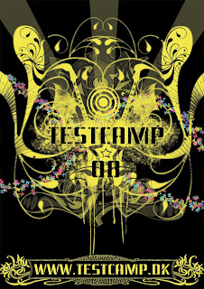
New assignment. Make a poster for testcamp, a scheme for young graphic designers. Simple enough.
With this image, I'm feeling like I'm finding my own personal style. It's a style I like to call Visual Free-Form, or, in layman's terms, make the viewer find something new in the image the 20th time they look at it. It's something one of my favorite artists, Hieronymus Bosch, did back in the Middle ages. The concept is simple; visually represent the activities that testcamp and its parent company Nørgård Mikkelsen are known for, i.e. radiospots, tv ads, posters, logos, graphic design and alternative advertising.
Now, I'm not going to start adding speakers, tv sets and the like. That's just too simplistic and obvious. Consumers can always understand when they are being patronized and they act accordingly. It's one of my pet peeves that advertisers don't respect their target group's intelligence. The connections are a little obscure and I want to leave it up to you to find which is which. That's part of the charm of this style, trying to figure out its internal logic. Ok, here is a hint, graphic design is represented by the spray tags.
One element that I wanted to add from the beginning was the stencil-like font and the spraying behind the testcamp logo. That's a carry-over from the current theme that testcamp is running. It creates a sense of continuity and evolution.
One element I DIDN'T want was stupid quotes and snappy one-liners, like "THE FUTURE OF ADVERTISING" or "THINK YOU GOT WHAT IT TAKES?!!!!1111oneeleven!!!!". If an image doesn't sell its product to you with a glance (and that's all posters and ads get by consumers, psychologists say), then you better rethink your concept. In addition, walls of text, while informative, will never work. It's called graphic design for a reason, it's the communication of messages with images. If you need to explain yourself to your target group, then you're using text as a crutch, i.e. your images are not adequate. Marlboro doesn't need to explain why the cool guy in the cowboy hat is smoking or the pleasures of smoking.
With this, I leave you to the poster I designed. Have fun.

Monday, 28 April 2008
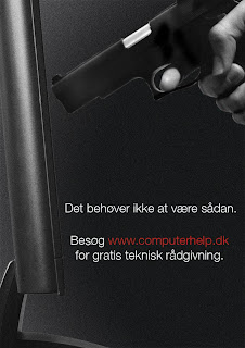
Put the gun down
Like I've mentioned, I consider doing mock advertisements for imaginary products a good exercise. It flexes my creative muscle and allows me to explore new options and techniques, especially for photoshop where there are more than one way of doing things.
This ad is for a hypothetical computer help service. The concept is someone holding a gun to the computer in frustration. I know I've felt this way before and I know you have to. In fact, I remember reading an article on Times Magazine, according to which the most used target in shooting ranges is personal computers. So, the concept behind this is that you don't have to resort to putting a 9mm through your Mac Book because it crashed on you (not yet anyway). Just check out the website.
I think it's interesting that I've decided to use a lot of noise and grain on this image. I don't really know where that idea came from, but it makes the image more interesting. Considering there is a gun in there and the composition suggests a story, I think I was subconsciously going after the Lethal Weapon style posters of the early 90s (i.e., really gritty, lots of intentional grain).
So, there you go :)

Aim for the head
I recently entered a competition for a tshirt design celebrating the 2008 Copenhagen Zombie Pub Crawl. Have I mentioned that I love zombies? Oh yes, I do.
This is one of my designs for the competition. The first thing that came into my head when I was doing brainstorming was George Romero, Ben Templesmith and the 70s in this order. George Romero for the obvious reasons, he is the grandaddy of the modern zombie genre. Ben Templesmith because he is my favourite horror graphic novel artist and because his style is so different than anything else out there, it looks like a cross between oil painting and stenciling (check out his website). The 70s because the zombie genre has been affected by this decade in terms of its politics and themes.
So, I decided that my design should have four elements; a) have an evocative image that tells a story of a world gone horribly wrong, b) be atmospheric, c) have a modernised 70s feel, d)refer to the event in some way.
Based on that I chose to give the Little Mermaid (a landmark of Copenhagen) a zombie face, then turn it into a stencil, and throw in a big splash of red color. Simple.
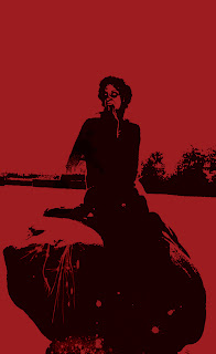 Note that the design looks a bit like the posters for the 30 Days of Night movie, which is based on the graphic novel of the same name, drawn by Ben Templesmith.
This is one of my designs for the competition. The first thing that came into my head when I was doing brainstorming was George Romero, Ben Templesmith and the 70s in this order. George Romero for the obvious reasons, he is the grandaddy of the modern zombie genre. Ben Templesmith because he is my favourite horror graphic novel artist and because his style is so different than anything else out there, it looks like a cross between oil painting and stenciling (check out his website). The 70s because the zombie genre has been affected by this decade in terms of its politics and themes.
So, I decided that my design should have four elements; a) have an evocative image that tells a story of a world gone horribly wrong, b) be atmospheric, c) have a modernised 70s feel, d)refer to the event in some way.
Based on that I chose to give the Little Mermaid (a landmark of Copenhagen) a zombie face, then turn it into a stencil, and throw in a big splash of red color. Simple.
Wednesday, 23 April 2008
Video profile
Yo!
I just finished (as in, directed, cut, and scored) a series of video profiles of teachers and students of Køge Handelsskole (college) in Denmark for use on their new website. It's one of the projects I enjoyed the most, because of the interaction between me and my subjects.
I approached this in a very rough way, inspired by Hillman Curtis' digital video work (go here for his website) and Wim Wenders' work in "Buena Vista Social Club" (, in that I steered away from a talking heads-only kind of mini documentary. What I was most interested in was the individual person's personality and that, to my experience, does not come out of asking formal questions to someone. It comes out of taking them out for a drink and talking to them until your throat bleeds and your vocal cords rip. Alas, I did not have the time to ruin my talking capacity, so I resorted instead to asking some basic questions, then asking something completely unrelated to the interview, but something I knew they were passionate about. I took the camera somewhere at the back of the room and let it roll while me and my subjects talked, argued, joked around, etc. I even let them direct a segment of the interview (hint, it's the part with the posters).
I can't post everything here, it's in excess of 20min, but I'm posting my favourite one. Thomas Christensen's video profile. Thomas is many things, a graphic artist, digital video producer and director, film buff and a great photographer amongst others. He's teaching visualization at Køge. Please ignore the fact he's talking in Danish (unless you speak Danish yourself) and enjoy the imagery.
Sunday, 20 April 2008
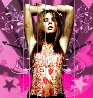
Girly stuff
The nature of the job of a graphic artist often means he or she has to do illustrations they normally wouldn't do. Not because they wouldn't like to, simply because it wouldn't be their cup of tea. But it's necessary to be able to adapt to a number of styles based on the client and the target group.
This is an exercise in making something really pop-y with a teenage girl target group in mind. It's also an excuse to try some new photoshop techniques I've been reading. The concept is a cd cover for a pop artist and I think it looks really nice. I imaged the artist sounding like a cross between Avril Lavigne and Fergie and let my personal style change in response to what images and sounds I could see and hear in my head.
I've used a lot of custom brushes, as well as pictures for the instruments and the speakers. The model originally wore a dress, but I drew a pair of pants just below the waistline, I thought it fitted in better with the style I had in mind. The model herself had some manipulation done in terms of levels, color correction and lighting.

Monday, 14 April 2008
Heavenly Spheres
I reaaaaaaaally like drawing planets and space. In Photoshop, with stencils, I love it. Must have been all those Sunday afternoon Star Wars reruns.
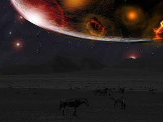
So, here is a new Photoshop image, called "Worlds At War". I like the juxtaposition of the calm horses below with the carnage on the planet above. It still is a work in progress, but I like the composition, so the main elements are there.
So, here is a new Photoshop image, called "Worlds At War". I like the juxtaposition of the calm horses below with the carnage on the planet above. It still is a work in progress, but I like the composition, so the main elements are there.

Subscribe to:
Posts (Atom)

