Showing posts with label design. Show all posts

Saturday, 10 May 2008

Heavenly Spheres 2


Hey.

I've mentioned my love for space-based illustrations on an earlier post. So, surprise-surprise, here is another piece. Most of the Photoshop techniques I used are similar to the last piece, but I used some new ones regarding the planets' texture, which involved extensive use of the liquify, smudge, burn, and dodge tools, as well as liberal doses of hue layers to create the colors.

I'll start doing some more traditional modern graphic design pieces, starting tomorrow. While I enjoy my more personal work, popular graphic design is moving towards a specific direction and I definitely don't want my work to feel outdated or lacking freshness. So, check this space out.

Wednesday, 30 April 2008

Eye candy

Hey world.

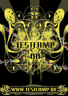
New assignment. Make a poster for testcamp, a scheme for young graphic designers. Simple enough.

With this image, I'm feeling like I'm finding my own personal style. It's a style I like to call Visual Free-Form, or, in layman's terms, make the viewer find something new in the image the 20th time they look at it. It's something one of my favorite artists, Hieronymus Bosch, did back in the Middle ages. The concept is simple; visually represent the activities that testcamp and its parent company Nørgård Mikkelsen are known for, i.e. radiospots, tv ads, posters, logos, graphic design and alternative advertising.

Now, I'm not going to start adding speakers, tv sets and the like. That's just too simplistic and obvious. Consumers can always understand when they are being patronized and they act accordingly. It's one of my pet peeves that advertisers don't respect their target group's intelligence. The connections are a little obscure and I want to leave it up to you to find which is which. That's part of the charm of this style, trying to figure out its internal logic. Ok, here is a hint, graphic design is represented by the spray tags.

One element that I wanted to add from the beginning was the stencil-like font and the spraying behind the testcamp logo. That's a carry-over from the current theme that testcamp is running. It creates a sense of continuity and evolution.

One element I DIDN'T want was stupid quotes and snappy one-liners, like "THE FUTURE OF ADVERTISING" or "THINK YOU GOT WHAT IT TAKES?!!!!1111oneeleven!!!!". If an image doesn't sell its product to you with a glance (and that's all posters and ads get by consumers, psychologists say), then you better rethink your concept. In addition, walls of text, while informative, will never work. It's called graphic design for a reason, it's the communication of messages with images. If you need to explain yourself to your target group, then you're using text as a crutch, i.e. your images are not adequate. Marlboro doesn't need to explain why the cool guy in the cowboy hat is smoking or the pleasures of smoking.

With this, I leave you to the poster I designed. Have fun.
Monday, 24 March 2008

More posters

Here is a poster I did for a presentation in India. Not much to say about it, lots of the decisions were dictated by the established style of Køge Handelsskole. What I am proud of though is the image on the top of the poster. It's the second of a series of posters I did for the presentation, the theme being "Projecting one's imagination onto clouds". Everyone has watched clouds pass by and imagined things, animal, faces etc etc on them. So, I made the connection between this activity and the advertised programs, the concept being that a person can shape the world based on that person's imagination, just as a person can see whatever it is they want on clouds by projecting their imagination on them.

Køge international brochure


Here are some select pages I designed for Køge Handelsskole's international brochure. The green circular thing is a futuristic menu that I thought fitted well with the school's philosophy of making the future, as opposed to waiting for it to happen.
I wanted a computer menu theme to fit in with the online nature of the degree on showcase here (multimedia). The thinking behind the specific design was breaking away from the current style of rectangular computer menus towards something that looks more like a media player, with different operations (like "OK", "Continue", and the text) presented in a different circle. I'm a huge fan of asymmetrical design and I tried to get this approach through to the design of the different "branches".
Check out also the green page above with the letters for background. I like using script and fonts to visually get a message across, so I had fun with that one.