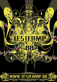
New assignment. Make a poster for testcamp, a scheme for young graphic designers. Simple enough.
With this image, I'm feeling like I'm finding my own personal style. It's a style I like to call Visual Free-Form, or, in layman's terms, make the viewer find something new in the image the 20th time they look at it. It's something one of my favorite artists, Hieronymus Bosch, did back in the Middle ages. The concept is simple; visually represent the activities that testcamp and its parent company Nørgård Mikkelsen are known for, i.e. radiospots, tv ads, posters, logos, graphic design and alternative advertising.
Now, I'm not going to start adding speakers, tv sets and the like. That's just too simplistic and obvious. Consumers can always understand when they are being patronized and they act accordingly. It's one of my pet peeves that advertisers don't respect their target group's intelligence. The connections are a little obscure and I want to leave it up to you to find which is which. That's part of the charm of this style, trying to figure out its internal logic. Ok, here is a hint, graphic design is represented by the spray tags.
One element that I wanted to add from the beginning was the stencil-like font and the spraying behind the testcamp logo. That's a carry-over from the current theme that testcamp is running. It creates a sense of continuity and evolution.
One element I DIDN'T want was stupid quotes and snappy one-liners, like "THE FUTURE OF ADVERTISING" or "THINK YOU GOT WHAT IT TAKES?!!!!1111oneeleven!!!!". If an image doesn't sell its product to you with a glance (and that's all posters and ads get by consumers, psychologists say), then you better rethink your concept. In addition, walls of text, while informative, will never work. It's called graphic design for a reason, it's the communication of messages with images. If you need to explain yourself to your target group, then you're using text as a crutch, i.e. your images are not adequate. Marlboro doesn't need to explain why the cool guy in the cowboy hat is smoking or the pleasures of smoking.
With this, I leave you to the poster I designed. Have fun.


