Showing posts with label photoshop. Show all posts

Friday, 23 May 2008

Logos


Hi. I have been working on a logo for my new website. Made in photoshop with some metal textures for the tentacles. I think it gets my style across well.

Saturday, 10 May 2008

Heavenly Spheres 2


Hey.

I've mentioned my love for space-based illustrations on an earlier post. So, surprise-surprise, here is another piece. Most of the Photoshop techniques I used are similar to the last piece, but I used some new ones regarding the planets' texture, which involved extensive use of the liquify, smudge, burn, and dodge tools, as well as liberal doses of hue layers to create the colors.

I'll start doing some more traditional modern graphic design pieces, starting tomorrow. While I enjoy my more personal work, popular graphic design is moving towards a specific direction and I definitely don't want my work to feel outdated or lacking freshness. So, check this space out.

Thursday, 8 May 2008

Say hello to my little friend!


Hello world.

So, I've been playing around with the actions function on Photoshop. It's got its uses, but the best thing about it by far is that it gives you the ability to create abstract art using fractals. A fractal is basically a complicated shape that is created by the repetition of a really simple shape and with some slight distortion at every iteration. A perfect example of how fractals work in nature is the humble snowflake and literally every crystal in existence (like diamonds).

There is some really interesting theory behind fractals and how life evolved, in that multicellular creatures are basically colonies of of like cells that started cooperating. Without getting into details, I thought it might be cool to replicate this process using Photoshop and try to see what creatures I could come up with.

Say hello to Ben, a biomechanical worm, courtesy of Photoshop, created by repetition and manipulation of a steam iron.

Monday, 28 April 2008

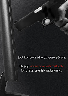
Put the gun down

Like I've mentioned, I consider doing mock advertisements for imaginary products a good exercise. It flexes my creative muscle and allows me to explore new options and techniques, especially for photoshop where there are more than one way of doing things.

This ad is for a hypothetical computer help service. The concept is someone holding a gun to the computer in frustration. I know I've felt this way before and I know you have to. In fact, I remember reading an article on Times Magazine, according to which the most used target in shooting ranges is personal computers. So, the concept behind this is that you don't have to resort to putting a 9mm through your Mac Book because it crashed on you (not yet anyway). Just check out the website.

I think it's interesting that I've decided to use a lot of noise and grain on this image. I don't really know where that idea came from, but it makes the image more interesting. Considering there is a gun in there and the composition suggests a story, I think I was subconsciously going after the Lethal Weapon style posters of the early 90s (i.e., really gritty, lots of intentional grain).

So, there you go :)
Sunday, 20 April 2008

Girly stuff

The nature of the job of a graphic artist often means he or she has to do illustrations they normally wouldn't do. Not because they wouldn't like to, simply because it wouldn't be their cup of tea. But it's necessary to be able to adapt to a number of styles based on the client and the target group.

This is an exercise in making something really pop-y with a teenage girl target group in mind. It's also an excuse to try some new photoshop techniques I've been reading. The concept is a cd cover for a pop artist and I think it looks really nice. I imaged the artist sounding like a cross between Avril Lavigne and Fergie and let my personal style change in response to what images and sounds I could see and hear in my head.

I've used a lot of custom brushes, as well as pictures for the instruments and the speakers. The model originally wore a dress, but I drew a pair of pants just below the waistline, I thought it fitted in better with the style I had in mind. The model herself had some manipulation done in terms of levels, color correction and lighting.

Monday, 14 April 2008

Heavenly Spheres

I reaaaaaaaally like drawing planets and space. In Photoshop, with stencils, I love it. Must have been all those Sunday afternoon Star Wars reruns.

So, here is a new Photoshop image, called "Worlds At War". I like the juxtaposition of the calm horses below with the carnage on the planet above. It still is a work in progress, but I like the composition, so the main elements are there.

The Dark Side


Hi all.

I've been working with some horror themed pieces lately. "Working" is not the right term, because I'm enjoying myself hugely, but you get the point.

Here is a female Nosferatu vampire, titled "Nosfarata" appropriately enough, made on photoshop with photomanipulation and using good old brushes. Enjoy

Monday, 24 March 2008

Køge international brochure


Here are some select pages I designed for Køge Handelsskole's international brochure. The green circular thing is a futuristic menu that I thought fitted well with the school's philosophy of making the future, as opposed to waiting for it to happen.
I wanted a computer menu theme to fit in with the online nature of the degree on showcase here (multimedia). The thinking behind the specific design was breaking away from the current style of rectangular computer menus towards something that looks more like a media player, with different operations (like "OK", "Continue", and the text) presented in a different circle. I'm a huge fan of asymmetrical design and I tried to get this approach through to the design of the different "branches".
Check out also the green page above with the letters for background. I like using script and fonts to visually get a message across, so I had fun with that one.

Wednesday, 6 February 2008

Posters

I do a lot of posters for people, mostly for short films. I personally enjoy it a lot and it's probably one of my favourite things to do on Photoshop. Figuring out the composition, the structure and how the colours and shapes will get the message across in a single glance are the exciting things about graphic art.

Here are some of my posters.

Tuesday, 5 February 2008

Painting in Photoshop

Just a little experiment to make a Photoshop image that looks like it was hand-painted. I really enjoyed this one.

Pop art

Pop art has been around for donkey's years, even if the definition of "Pop" itself has changed. When I think of pop art, I think of Warhol and Lichenstein (I'm sure I've killed the spelling), neon colours, etc, but that was pop in the 70's. Isn't there time for Pop Art to be redefined for what Pop stands for today, or will it remain a symbol of another era?

Here are a couple of images I created on Photoshop. One of them is of Eliza Cuthbert being Marilyn Monroe-like, the other one of an orchid, both of them Pop Art style.


The solution to hair loss

One of my favourite things to do in Photoshop is to draw hair. It's hard, long and repetitive, but there's something about drawing every single strand of hair with a certain look in mind.

My model is Bolton Wanderers player Stelios Giannakopoulos.


Original